EEPROM/Flash command GUI (UI/UX feeback needed)

The experimental build has a prototype GUI for the I2C eeprom command. In I2C mode type eeprom without any command line arguments and the GUI should pop up.

The top bar is a drop down menu. I’m ok with this for now.

The next bar is the configuration bar. up/down spinners select the action, device, etc. Enter on execute to run.

The bar below is the help hints/info bar. It changes based on context (config or hex editor focus).

  • I’m not sure if this should be above or below the “info bar” with help hints.
  • I feel like it should A. Have another line with a label for each config option, or B. perhaps a dimmed out initial value describing the option (start value “action”, “device” “file”).

It has a reusable popup widget.

Also a file picker.

This is the “golden prototype”. The goal is to get it perfected on I2C eeprom, then add a UI to every other command that reads/writes memory.

I could really use some feedback.

  • What do you hate?
  • Color/theme suggestion? Appearance
  • Work flow/ease of use/intuitiveness
  • Position of hint bar & config bar
  • Labels or initial value labels for config bar?
  • Anything missing?
1 Like

After testing for a while I think it needs a good rework to be more like a eeprom programmer than a wrapper around the eeprom command.

FILE

  • Open
  • New
  • Save
  • Save as
  • Close

Much more integrated editor/programmer than a wrapper. Can dump the chip, have a look, choose to save, modify, save again, burn back. More based on a working cache than everything going directly through the file.

ACTION
Actually perform the action rather than populate the menu

2 Likes

Looks amazing! Well done. You’ll be knocking out PFS:Write in no time. Now to paint the bikeshed. Please consider…

  • Forgoing compatibility with the VT-52 and use the Unicodeline/box drawing characters. DEC Line Drawis probably well implemented enough in the various consoles out there. Remember, it’s less about the terminal program and more about the ‘console’ that the app is running under.
  • IMO, the ‘hover text’ should be below it, not interrupting the flow of scanning unless you seek it.
  • Your option (B) is the stronger UX. Disappearing ‘disabled’ text is there when you need it and not when you don’t. It’s something people are accustomed to.
  • Look for ways to increase contrast between the ‘active window’ and the background. Maybe that’s making it bold. Probably that’s making it white or even better, bright white instead of grey in blue.
  • Android and MacOS use the dismissive action (Esc=cancel) on the left and it’s part of the platform guidelines. Pick a side of the road to drive on and enforce it. (Example: in Qt, that’s part of their MessageBox/MenuBox thingy so it can be flipped when building for different OSes. You get consistency by making it part of the toolkit and not letting every dialogue author ‘invent’ something.)
  • Scrollable elements tend to have ‘elevators’, usually on the right, showing your location in the bigger picture. It’s completely sensible to value horizontal space over that here. It just catches my eye that you don’t know if MACROS.MCR is the last element or if there are a zillion more after that.
  • The magenta for addresses seems too ‘hot’ for its contrasting peers. Consider an online complimentary color picker (* demo picked without much evaluation) to help group like things together.
  • Instead of an octothorpe, you can add some visual heft with block elements.

Even if you implement exactly zero of that, this looks great. Thank you!

2 Likes


Thank you so much! I implemented most of these. They are all great recommendations, but some (UTF8) could have downstream impacts on some of our automated tooling so I skipped those for now.

Sorry, no push yet, still tracking down a regression. Done so far:

  • Color scheme changed from default ‘hx’ theme to match the existing hex command.
  • Order and styling and wording of all dialogs are now fixed in reusable macros so the order and wording is consistent and doesn’t depend on implementation.
  • Color and style of config bar updated, but still needs differentiation from the menu
  • Placeholder text in spinners instead of labels
  • File browser now has 3 columns, with elevator and X/Y file count indicator
  • File browser now supports sub directories.
  • Context dependent info bar is moved to bottom with improved styling
  • Didn’t implement a strict focus thing, but I did sort out the issue where the “cursor” was still shown when tabbing between active areas (config vs hexedit)

Default spinner labels.

File picker, multiple columns and elevator, file count indicator. Shows folders.

Navigating into a folder.

Next steps

In general it needs to be more like a desktop EEPROM programmer (dump to buffer, edit, reflash) rather than a command wrapper. Planning in progress for this.

2 Likes

That looks great! Thank you. Happy to be your “second opinion".

That color scheme says less “strip club" or “weed shop”[¹] and more of a tasteful accenting story.

You consistently knock it out of the park with this tool. Stay awesome.

[¹] Not that there’s anything wrong with that. There’s just a place for it…

2 Likes

“LED Christmas lights don’t read Christmas, they scream vape shop” :slight_smile:

The project we integrated used that and I deferred to their sense of style, but you were absolutely right it should be rendered in the default bus pirate theme colors that can be adjusted system wide in the platform file.

1 Like

Within the hour, I deployed 30M of wa2812 in my house. Wrangling excessive chroma vomit was task 2. (Correcting for the smell of a failed 74ALS215 that took out the esp32-c6 - or vice versa - is task 1.)

More Aurora Borealis. Less “SALE SALE UNDER NEW MANAGEMENT 241 BONGZ!!!" Please. :laughing:

2 Likes

Yes, please! And as a corollary, the rate of change doesn’t have to limited to “greyhound → rocket ship” … smooth and mellow changes that are subtle are just so much nicer to have always-on.

1 Like

I really want to differentiate the “config bar” (here, dark grey), but I’m having a hard time finding the option in the basic VT100 color codes. Now I think it overtakes the menu above.

Another thing I cribbed from the link above is to add F1-Action F2-Device, etc, instead of a single F10 drop down menu trigger.

Nice! Make that gray and emphasize the accelerator keys, and I think you have got something that would definitely feel familiar.

The character mode conventions (I think they were rooted in IBM’s CUA) would have been to have the menu grey (which gave it some depth, as it looked ‘less important’ than the main edit/input/action area).

Later versions of Word (both for UNIX and DOS) got this “right”; older ones had the menus at the bottom.

There were books that had all of the “rules” of that era, like uniquely naming accelerator keys and color conventions and such, but it’s safe to say that they’re no longer on the shelf at your local Egghead or Waldensoft. :slight_smile:

Then again, acting like a ‘normal’ app from 1988 might not be much of a goal in an industry where only a vanishing few of us have muscle memory of that era.

1 Like

Sometimes the classics are classic for a reason :slight_smile: I’m happy enough with this to proceed to the final stage.

  • F key jump to menu
  • Menu bar theme changed to “word 5.5 like”
  • Refactored and folded a bunch of vt100 handling back into the vt100_key library
  • Removed old code compatibility defines that kept edit/hexedit in sync with the upstream project - the LLM grinds to keep the dead code in sync with the rest of the new code and it’s blown up any backwards compatibility while also wasting time.

The final thing, which is a bit nerve wracking, is getting the UX right. Currently we can dump a chip and see the contents in the hex editor. We can edit the contents, but there is no way to save or write the modified contents back to the chip.

The main limitation is RAM. We have ~118K buffer for the chip contents, so anything beyond that is "read only"mode and must still be handled as a file. I really want to avoid two parallel routes (work in RAM vs work from storage) - so maybe dump goes to a temporary file now, which we can save as? I’m not solid on the workflow just yet.

This is kind of half way there. Not sure I actually like it better, and the exact state of things is not exactly intuitive.

1 Like

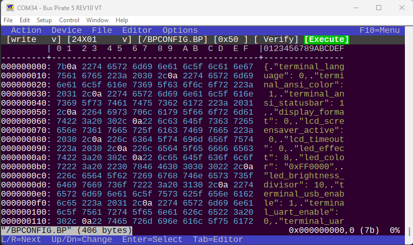
Visually, that looks great, Ian. Thanks!

I didn’t even have to drag out fossils like Tandy Model II/XENIX Multiplan! :slight_smile: (We’d put 10 ASCII terminals on systems smaller than a BusPirate!)

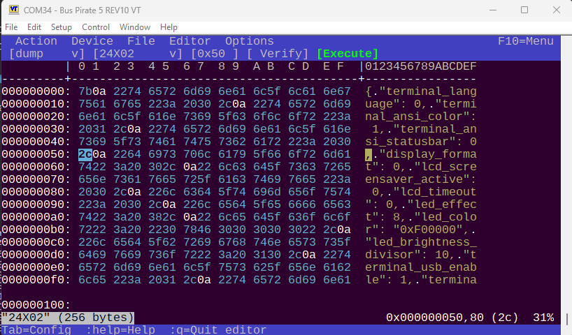
What do you really consider the use case here? I’m sure you’d shame my use of PROM editors but since my primary interface was a hex keypad and a fluorescent calculator dispdisplay,ever really went beyond tweaking a few strings/copyright dates here and there, adding a few opcodes to the end, patching some jumps to call those, and back and so on. So in MY usage - which, admittedly, was about when CUA was in vogue, the total bytes changed was a very small percentage of the PROM (or else I’d justfire up the UV light, erase the chips, reassembler, re-split the bin across PROM, and march on. It wasn’t like insert and delete byte ranges were a think that made sense on my ‘186s or whatever.

Isn’t 100K enough to hold a copy of any EPROM that would make sense to modify totally in RAM? Reading it into RAM, modifying it, and then writing it back to the device is legit.

I did work once on a MIPS (?) system that allowed “patching” boot ROMs when they were read, though it was strictly changing and appending, not inserting and deleting. worked by keeping an internally SORTED list of pairs of offsets/words (could probably do bytes if you cared) that was like a patch list. So taking your second list, it might have an array of
rec[0] = 0002,0405
rec[1] = 0100, 0304
rec[2] = 0102, 0506

When it was time to write the file, it would look at the first entry in the list (I’m typing this as an array, but it was effectively a stack or a circular queue that never wrapped, which is kind of a stack) and see how far it could go. Could copy the first word (a memcpy of 2 bytes is still a memcpy and not a special case) from the source. Then it would start pulling from the patch list until the address jumped. Write the 0405 to address 2, and then go back to reading the flash. How far? Well, now the “head” was at 0x100 so we could copy 0x253 (?) bytes until we got to 0x100. Now we switch to sourcing data from the patch array. Pull the 0304. Next? 0102 is in the deck AND is our next destination, so we pull the 0506. Next entry? We were at the end (I don’t know if it was a special marker or a tail pointer or some other indicator that we were at the end of the patch list, but from there, we’d finish the memcpy sourcing from 0104 and running to the end.

Maybe that’s too limiting and maybe it doesn’t help with the problem at hand.

Good luck!
It was definitely a limited form of editing, but it matched the real world of what we ever expected to do with a PROM burner (reasonable expectations/needs of tools have surely changed in the last 40 years, as you, our reigning toolsmith to the toolmakers, would well know). but you could hold the original AND the “patched” (via some slight of hand because you were generating the patched one on the fly) in some smaller amount of memory than we had. It was early in my career, and I remember being impressed then by the clever data structure. For all I remember, it might have even been changing the source pointer via self-modifying code or double indirection or something masochistic - whether it was on our programmer or the boot loader of the system I was thinking of, resources were really paltry compared to what we have today.

1 Like

Yes, this is the goal and we’re kind of there now. The latest iteration will dump chips to RAM, they can be modified here and there (e.g. your dates and strings) and burned back to the device. The buffer can also be saved to disk in original or modified format.

Previously the workflow was like this:

  1. Read EEPROM to file in eeprom command,
  2. Exit eeprom command
  3. load file in hexedit command
  4. make changes
  5. save, exit hex editor
  6. Start eeprom command again
  7. write file back to eeprom.

We’re quickly moving toward a simplified pattern:

  1. Dump eeprom
  2. Change value as needed
  3. Burn back to chip.

The only little oddity is that chips > 512 (which are not actually common EEPROMs in my experience) are too big to fit in RAM so they still need to go through the file route. Currently there is kind of a compromise approach where we dump to a temp file and make the hex editor read only mode.

Many flash devices have large unused / erased ranges. Would it help to only keep track of erase-size sections, where the values are not all 0xFF?

The next step in complexity would be as above, with a fixed number of erase-size sections, and a “dirty” (modified) flag for each. When you run out of sections, first drop the non-dirty ones.

If all but one are dirty, and another page needs to be loaded, then you’re in the danger zone. Any edit to a page will require writing at least some of those dirty pages back to the flash, before you can load the next page. (or dump the data structure to a file…).

1 Like