We use Docusaurus to generate a static docs site that is hosted at render.com. Our Docusaurus is v2.x which is years out of date (currently v3.x). I would stick with v2.x but so many things are deprecated it is increasingly difficult to bait render.com into compiling successfully.
After update to v3 there are a ton of compile errors, which I managed to squash. However, it absolutely hates the Bus Pirate example output. I cannot get it to format correctly.
Docusaurus has always been fidgety. Sometimes 2-3 blank lines are randomly needed between text or compilation fails. Escape doesn’t always work consistently. Every release more characters need to be escaped or entered as unicode. It’s also slow and the index pages are hideous. However, it is well supported by Facebook…
Some options:
stick with v2.x until so much is deprecated that we are forced to migrate to another jamstack
move to another stack now before a full update
re-do all the docs examples as plain text black and white output to satisfy docusaurus v3.x
I’m going to start with a Hugo tutorial, which is blazing fast and written in Go.
What kind of source format do you currently use with Docusaurus? Is it something common like Markdown or is it something specific to Docusaurus?
As you see I’m not familiar with Docusaurus.
I have used Hugo for several static websites and quite like it. I usually write the actual content in Markdown and then use Hugo to create things like site navigation and so on.
It also makes it easy to use any simple webserver that just serves HTML, you don’t need any kind of CMS, Wordpress or similar complications.
You can then add a local search function to your static hugo site with https://pagefind.app/
It is 98% markdown. Most of the other features we use a few places (tabs) seem universal in any package built around Hugo.
Two things stand out. Docusaurus uses :::tip to make alert/call out boxes, while the hugo package I’m currently using has some very bracey syntax.
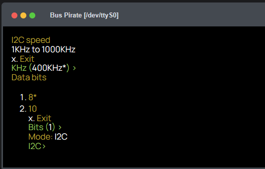
The other is the typescript console frame (shown above) which is a react/typescript object that would have to be hugo-ified (or take the perilous route of getting react and typescript working in hugo, which looks not great). I imagine it is not much different than the call out box functionality.
I’ve imported several pages into Hugo/Lotus Docs and it’s honestly super easy to work with. The multiple search integrations are really nice too. It’s close enough to the current theme that styling wouldn’t be too bad. I believe it does responsive images out of the box, it would be nice to just upload full size images and let the package do resizing.
It definitely shows promise and is lightening fast. I will continue with customization and see if I can get some kind of console looking thing going, that will be key because it is used a lot.
I found the alert code and will try to copy how it works for a console widget.
Ugh, I wanted a week of docs updates, not a week of bringing up a new site. If I have to do a 100% refresh there is no point in sticking with a dead end framework.
Hey @ian , I build all my sites with Hugo and Jekyll, and they work well. However, some templates aren’t very responsive—they don’t display properly on mobile, and some navbars don’t work well on mobile either.
It’s important to choose the right template… I’ve had to adapt more than one theme to make it work properly in the real mobile phone world.
If you need help porting content or anything else, just let me know—I’ll be happy to help!
What do you think of lotus docs. Looks OK on my phone and is regularly updated. It does use bootstrap which I guess is old fashioned now, but I know how that works. React/typescript/flexgrid (docusaurus) I can’t really hack much, and node in general rubs me the wrong way.
For documentation, I usually use Hugo Docsy because it’s also supported by Google (though I had to fix some things for the mobile version…).
I like that the content search works with local JavaScript, without relying on third-party services—that’s how I have it set up.
I didn’t know about Lotus, but it looks great! I tested it on mobile, and it dont works well!
We should choose whatever causes the least issues in the long run—constantly switching frameworks, technologies, and updating everything is a pain. I honestly don’t know which option is the easiest to maintain in the long term.
I just realized that in that lotus theme, sometimes tapping the search icon () on mobile (iPhone & Chrome) doesn’t work.
@ian Try navigating, scrolling, and then tapping the search icon—it doesn’t always respond.
Can you test it on mobile and let me know if the theme works properly?
Try switching pages, clicking on the navbar, opening the menu, and tapping the search icon ()—does everything work as expected?
We’re old-school and use PCs a lot, but the new generation relies heavily on tablets and phones… I know many people who barely use a PC or don’t even own one.
Everything web should work flawlessly on mobile, in my opinion…
And yes, this is a pain I deal with every day—it adds a lot of extra work and hours spent. Just my two cents.
I’ve hired a Hugo developer to fix the search and do the theme customization as well as a few other things. I will continue with docs update, but it will be 2-3 weeks before they get the customization done.
Thank you so much. I’ll discuss with the programmer.
I’m very happy too. Docusaurus looked OK, but I always felt like the table of contents page icons look super cheap and amateur. Come on Facebook, certainly you can come up with a nice icon
Porting to the new framework (and docs wide refresh) will start soon.
The logic of this is that I thought we would use the versioning feature of docusaurus. Since the hardware and firmware interate differently, it made sense to split them.
In reality we don’t use it. The latest firmware is the latest firmware, no reason to keep old stuff around. Hardware turns out to have multiple versions in air at the same time so doesn’t make sense there either.
I feel like it might be a good idea to combine it all at docs.buspirate.com. a hardware section has docs for each production version, the firmware can remain about the same at the top level.
Firmware.buspirate.com.can then direct to a firmware download, which is a lot more intuitive.
Yeah, I think that’s a better idea. I never liked having two separate but very similar websites— it was a bit confusing, in my opinion.
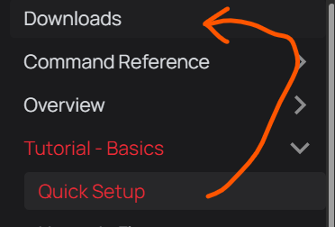
As a suggestion, the first thing I’d always put in the documentation is a Getting Started section
(Tutorial – Basics / Quick Setup).
I think the ideal flow should be:
A beginner buys a Bus Pirate, and then—“Now what?”
So, as soon as they open the docs, the very first thing they see is exactly what they need to start.