The PLANKS should have their own section or subsection—
right now everything is a bit mixed together.
It would make things much easier to find and understand!
The PLANKS should have their own section or subsection—
right now everything is a bit mixed together.
It would make things much easier to find and understand!
Good suggestions. We can probably have a dedicated planks/adapter section too now, since there are enough it doesn’t look sad ![]()
Agree.
/Words words words/
I agree with using https://docs.buspirate.com/ as the logical place for the documentation.
Even if it’s not used now, I’d recommend having the root of that site be a landing page, and documentation root actually being https://docs.buspirate.com/bp5/latest/. It costs nothing to do this now, and allows for easily supporting versioning later without having to have folks change links / etc.
It also allows the home page (root page) to give a purpose / overview of the site, indicate what hardware it applies to, etc.
Got an update on the docs site. It is coming along.
Using Hugo is so much more pleasant than using docusaurus. I actually like writing docs, it’s one of my favorite parts of a project, but docusaurus made it such a pain in the neck that I avoid it.
Latest docs theme. I think it is nearly done. @dreg do the button sizes look better?
Does the site generally look ok on everyone’s browsers? CSS can be so fickle.
Desktop:
Firefox Nightly → Working perfectly
Edge → Working perfectly
Chrome → Working perfectly
Samsung S20 Ultra 5G Phone:
Firefox Nightly → Working perfectly
Chrome → Working perfectly
Samsung Internet → Working perfectly
Edge → Working perfectly
Samsung S8 + Tablet:
Firefox Nightly → Working perfectly
Chrome → Working perfectly
Samsung Internet → Working perfectly
Edge → Working perfectly
Thank you so much! It is comforting to know ![]()
It looked good on all of my devices, too (Linux desktop/chrome, Pixel phone, iPad).
Attractive design and colors, looking forward to the updated docs ![]()
(One thing I really like is that there aren’t huge swaths of useless whitespace, like you see with so many web/js/css frameworks. That drives me crazy)
I tested it on an iPhone 16 Pro with Safari, and I think the quality is more than acceptable—it looks super clean, the buttons work great,
honestly, an amazing job as always! ![]()
LGTM, on Edge / Win11 with high-dpi display.
Thanks everyone! Let the migration commence tomorrow!
To me it looks like the console view dosen’t correctly render in light mode yet:
Go to Theme Updates | Bus Pirate 5 Firmware
Enable light mode
Have a look at both the style and class console versions
Some of the white text like “Set current limit?” is not visible for me, at least in Firefox and Chromium on Linux.
In dark mode the text is visible without problems.
Excellent catch, thank you so much!
Live site, may not be the latest.
Should probably write a python script for this, but it is a one off…
Basic method of porting:
Sections are in directories. For the directory to appear in the menu, add a _index.md file with frontmatter:
+++
title = "Binmode Reference"
description = "Bus Pirate binary access modes"
icon = "article"
date = "2023-05-22T00:27:57+01:00"
lastmod = "2023-05-22T00:27:57+01:00"
draft = false
toc = true
weight = 200
+++
-–
sidebar_position: 1
sidebar_label: ‘Commands’
-–
Becomes
+++
title = “Commands” <<change
description = “Complete Bus Pirate command reference” <<change
icon = “article”
date = “2023-05-22T00:27:57+01:00”
lastmod = “2023-05-22T00:27:57+01:00”
draft = false
toc = true
weight = 1 <<<change
+++
There’s a bunch of global search and replace I need to do first. I’ll get it into the repo asap.
Console rendering in light mode now works for me.
With the exceptions noted above, that firmware side images have all been relinked. Live site updated.
Tomorrow I’ll reorganize the hardware side. I welcome any suggestions because there’s a lot and it’s currently a mess of levels.
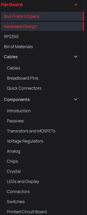
hugo serve -DHere is what is currently in the hardware category.
Some of this should probably be in a stand alone category. Enclosure, cables, and manufacturing come to mind.
Then perhaps a singular category for hardware writeup, BOM and components sections for each major release?
The components pages are fun, but I’m not going to keep updating them. That would be a huge undertaking, and they were intended for internal use that might have been interesting to others.
Live docs site. Be sure to add /docs to the URL, or you may see the default front page.
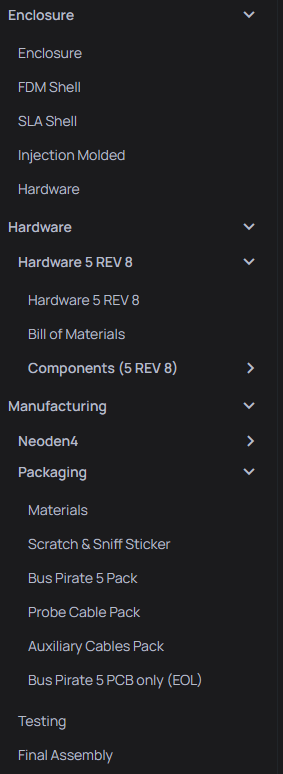
Reorganization is done for now.
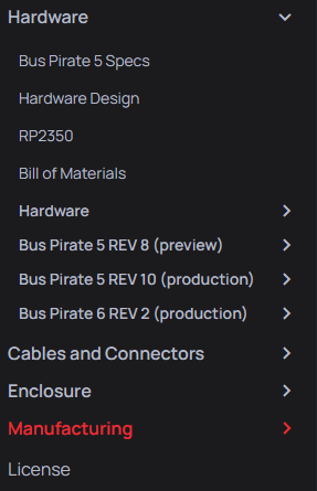
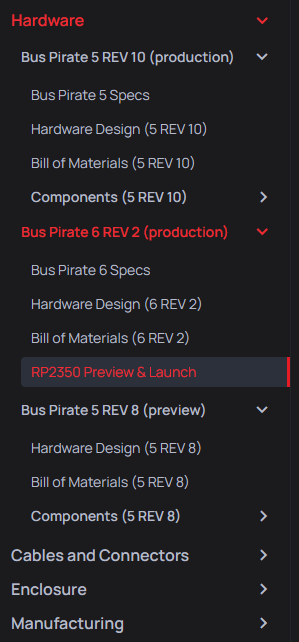
Did some minor major cleanup of the hardware to get clean separation for each released version. It was kind of a hodgepodge of 5/5XL/6. Now each is separate. There is still more work to do updating the 6 design overview, but it is less confusing now.
All the images seem to be ported. I disabled the webp responsive image stuff because it was just making everything worse.
Now is a huge task… updating all the broken internal links. I’ll push the site live and run a dead link checker to get an idea of how awful that cleanup is going to be. This is where I could use some help @dreg.
Just noticed I forgot to update the manufacturing section, doing that now.